Manage focus when a React modal opens and closes
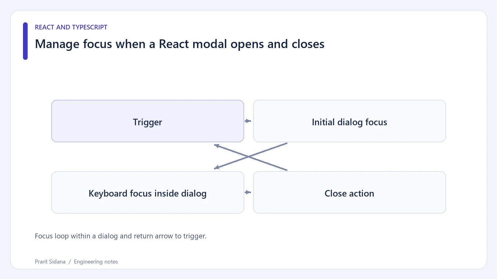
Opening a modal changes where keyboard interaction belongs. Focus should move into the dialog, stay within its controls while it is open, and return to a sensible place when it closes. A dark backdrop alone cannot provide those behaviors.
For a synthetic "Edit contact" dialog, start with a visible trigger button, a named dialog and an explicit close button. A maintained accessible dialog component or a carefully tested native dialog can carry much of the interaction work. Confirm its behavior in the actual application instead of assuming that a role attribute supplies it.
The WAI-ARIA modal dialog pattern describes initial focus, contained Tab navigation and Escape-to-close behavior.
Focus loop within a dialog and return arrow to trigger.
Walk through the keyboard path
Activate Edit contact with the keyboard. The first focused element might be the name input in a short editing form. In a long explanatory dialog, focusing a heading with tabindex="-1" can keep the beginning of the content in view. An irreversible action may justify starting on its least destructive choice.
Press Tab until reaching the final control, then press Tab again. Focus must remain inside the open modal. Repeat backwards with Shift+Tab. The page behind the dialog should be unavailable for interaction while the modal is active.
Close the dialog with its close button, then reopen it and close with Escape. Check where focus lands each time. Returning to the trigger works when that trigger still exists. If saving removes its row, move focus to the next appropriate control, such as the updated list heading or the next row's action.
A button containing only an icon still needs an accessible name. The dialog itself needs a name connected to its visible heading. Avoid using a large block of structured content as one long description when users should navigate its paragraphs or table separately.
Keep React and browser state coordinated
When using a native dialog imperatively, synchronize React's open state with browser close events. A user pressing Escape can close the browser dialog without clicking the React close button. If React still believes it is open, a later action can behave unpredictably.
Do not build a second competing focus trap around a library that already manages one. Nested overlays, portals and temporary disabled controls can expose conflicts. Check a dialog opened from inside another overlay if the product supports that path.
These checks cover a modal interaction, not the correctness of the form inside it. Validation, pending saves and unsaved-change warnings still need clear behavior. Verify those states while the dialog is open, including what happens if its trigger disappears after a successful save.